Blog Bites: Designing the Perfect Mantel

Fireplace mantels often stump people. How to accessorize? How much? With what? And while all of a room's elements may be perfectly in place and creating just the right look and feel, a fireplace mantel has the potential to detract from that. I have a few basic rules I follow: (1) aim to occupy at minimum two-thirds of the visual space above the mantel, (2) vary the heights of the accessories, and (3) keep it clean (or related; in other words, resist the temptation to just plant things there to take up space)!

Clients often struggle with the selection and placement of art and accesories, particularly when it comes to the fireplace mantle.  Typically the focal point in the room, everyone wants to get this right!  Working with my niece on a on a fireplace "redo" (pictures to be posted in a separate post), I thought this would be the perfect time to search for great posts on this topic.

Cristin of Simplified Bee offers some great tips on decorating mantels, which, she starts off by saying, are a natural focal point. All the more reason not to overdo it when accessorizing. One of my favorite tips from Cristin's post is to keep the design "balanced and proportional." Take a look at these designs to see why these work so well.

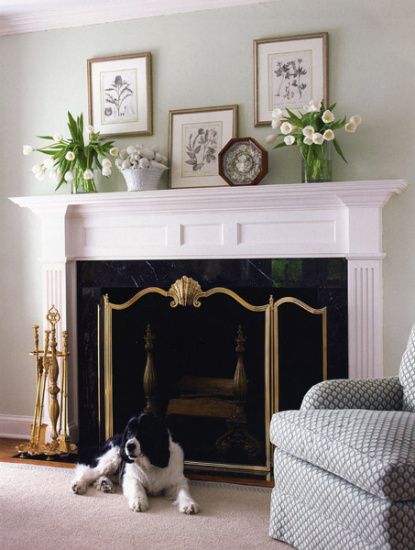
The high ceilings in this room demand accessories with real presence. In this traditional room, I love the series of six botanical prints in a symmetrical pattern and balanced by vases on either side of the mantel.

Mantel by Norman D. Askins, original photo source unknown, via Simplified Bee

While it's difficult to tell how tall the ceilings are in this room, it's easy to see that the artwork doesn't overwhelm the space. The art takes the primary position, and the varying heights and textures of the accessories move the eye across the space of the mantel -- a very clean, crisp look that allows the gorgeous fireplace to truly soak in all the attention.

 via Simplified Bee, Photographer: Erik Goldstein

The funky, modern style of this living room calls for some funky above the fireplace, too! A vibrant mirror takes center stage. While this design is nearly symmetrical, Cristin points out the seashells on the right and the bird figurine on the left. A truly symmetrical design wouldn't feel right in a room like this. Do you agree?


Here's a great example of that two-thirds "rule" I mentioned. Not that anyone is going to (or should) get out the measuring tape, but this looks pretty close, right? And take note of the varying heights of the candlestick and crystal figures. If you imagine this differently, with the same accessories on either side, would you like it as much? I love the balance and proportion that was achieved by using a "lighter" accessory on the sofa side of the mantle.


Our next post, Mantel Mania, comes from The Lettered Cottage, blog of Layla and Kevin Palmer. Here's a simple design for a mantel that covers a lot of horizontal space. Botanical prints are spread out and displayed at different heights and the natural motif is picked up in accessories, including crisp, white (if not a tad floppy) tulips. What do you think of this? Do you like it or is something off to you? 

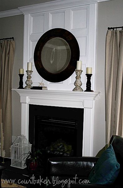
Because I personally have a hard time seeing anything but the octagonal frame, I had to remove it with a little Photoshop magic; take a look, below.  Ahhhh, much better.  I still am not sure about the resting frame.  I love the idea of layered frames but feel it is more effective when the size is varied.  Do you agree?


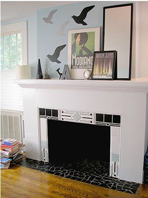
This next asymmetrical arrangement uses a mirror and prints on one side balanced by accessories and vinyl wall decals on the other. Cool, chic, modern, and goes perfectly with the style of the fireplace itself.


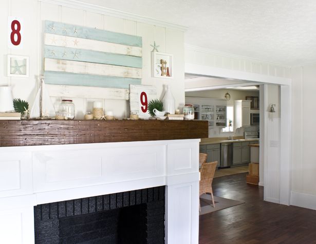
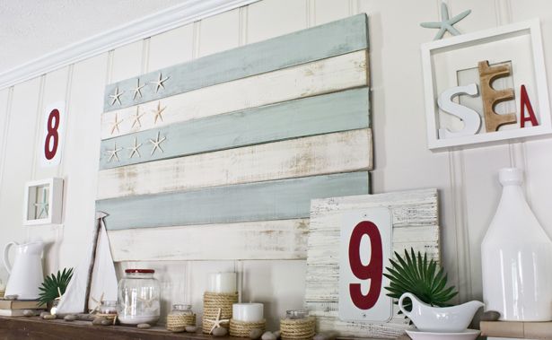
Layla helped client, Courtney Baker, with the design for this beauty. The molding above the mantel wasn't originally there, but creates such a dramatic effect. I would be inclined to go with lighter and more unusual accessories but wanted to showcase the gorgeous look that can be created by extending your "mantle" up to the ceiling.


A little bit of a diversion from my "blog bites" intent, I just have to include a few more posts from The Lettered Cottage. This year, Layla and Kevin set out to change up their home's mantel design with the change of seasons; and they blogged about each one along the way. Here's a little something just for fun!

Spring
Photobucket

Summer
Photobucket

Photobucket
Summer Mantel Images: The Lettered Cottage 

Fall

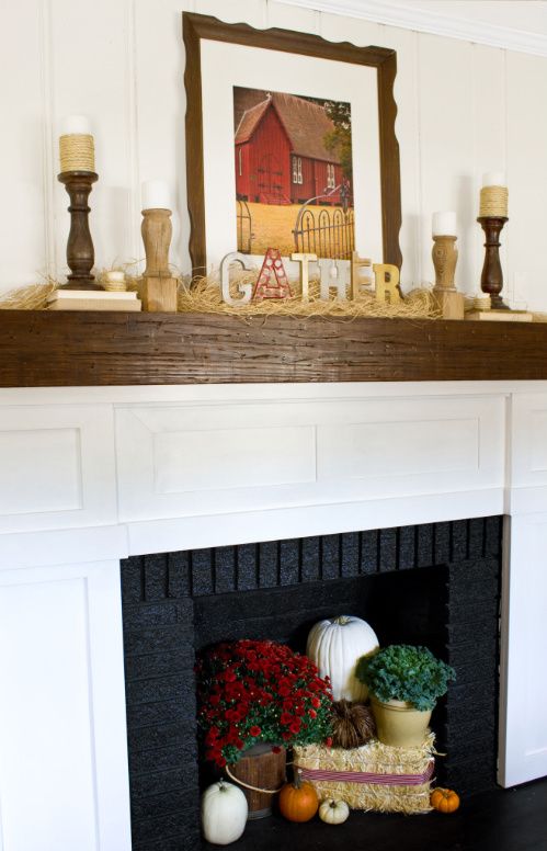
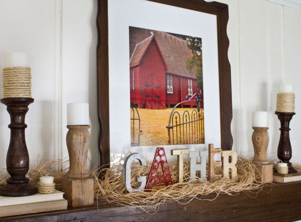
Fall Mantel Images: The Lettered Cottage

And perfectly appropriate for our current season; here are a couple gorgeous winter stunner's.


photo courtesy of Southern Living

So tell me, is this a decorating area you have struggled with?  I hope this has given you some new ideas.  A always, if you have some great ideas on how will you be changing your mantel decor this season or great tips to create great looks, we'd love to hear them!

If Your Walls Could Talk

Michelle, from PeasoutMama, a self-professed "word nerd" has put together some inspirational ideas on taking your love of the English language and using that as a design element in your home.  Great humor. Great ideas! Thank you Michelle! 

It's true. I'm a word nerd. Love to read, love to write, love soaking in a good library or bookstore. Books are great...really great. So great that while my mom (my mom) owns a Kindle, I will always tenderly embrace my books with their real covers and real pages. Also, I rock a mean Scrabble board. Just thought I'd throw that out there. And yet, in spite of all this, when I look around my home, these words, these books, rest closed on shelves.

Sniff.

This got me thinking. Sarah posted an interesting question on facebook a while back. Maybe you read it, maybe you responded. Here was the question: If your walls could talk, what would they say? Well, turns out your walls aren't too flattering. Funny little dudes, but not so nice. I understand. Mine are downright mean sometimes. I went on a quest for inspiration when it comes to decorating with words and found some pretty cool stuff I thought I'd share. Because word nerds are also generous.

Check out this living room by designer Maureen McCluskey. This is so cool. Needing to know more about this design, I emailed Maureen, and lo and behold, her gracious self responded with tons of great info. Thank you, Maureen! Turns out this design is for her sister and brother-in-law's home. They wanted to do something interesting, but not distracting, behind the television in a room with high ceilings. She chose to cover the entire wall so it'd have the effect of a pattern, which is why, she told me, they chose all lower-case letters. They ordered stencils and did this themselves. Yes way! The quote itself? Lyrics their cousin wrote for his Chicago-based band. Talk about one-of-a-kind!

I'd have to choose a quote my toddler won't ask me about in a couple of years; this quote features, "there was a stumble there was a fall there was tequila." I'm all for tequila, but methinks I'd prefer to avoid the inevitable questioning: Mommy, what's tequila? And why are people falling? Any DIY-ers out there inspired to take something like this on? If so, promise to come back here, leave a note, and link to your finished product photos! Pinky swear?

Masculine Media Room contemporary family room

Speaking of toddlers, take a look at this playroom by New York interior designer Esther Sadowsky. Mama Little Boo (my adorable little guy) would dig playing in this space. Feeling inspired to create just by looking at it! (And I love journey over the entryway...super cute.)

playroom eclectic kids
Okay, I could never do this in my own home, mostly because I'd love it for about a month and my husband would never love it, which means I would never enjoy it. Know what I'm sayin'? But in someone else's home? I could love it forever. This look comes from designer Kress Jack's own home and uses old sign letters.


I puffy heart this next one in a big way. As if puffy hearting it wasn't enough. Let me explain. Once upon a time, I was an English teacher. There's just something about a chalkboard (especially lots of chalkboard) that gets me every time. Word nerd, remember? Weeee! There's even penmanship. Real, live penmanship. Double weeee! (Do you think it's Palmer Method?) If only I could read it...

Faiella Design by Anastasia Faiella eclectic dining room

You can't help but get a little ironic chuckle out of this next one by Pierce Allen. Irony...it's better than sarcasm. Awesome bold graphic letters. And are those Os actually mirror frames? Looks like the mirrors have been removed, but what if they weren't? Oh yeah, I don't design; I write. But I can ask questions, no?
Pierce Allen contemporary living room

Saving the best for last. Type on trees. Trees! How insanely cool is that? Get outta here! So remember my little nod to libraries earlier? These columns were designed for a library (yay!) by why not associates and Gordon Young. Hoping these served a load-bearing purpose, too.      

why not associates

The result? Behold Crawley Library in the UK! Those Brits got it goin' on. Except that the photos are copyrighted and I can't use them. If you're feeling a little click happy and want to check it out (you do...really, you do), visit Crawley Libary on flickr.

So what's your take on all this? Yay or nay to words? Do you have words on your walls? Letters? Showing a little book love? Share your ideas, inspirations, or words of caution. Because lordy knows my walls have been talking some serious smack lately.


Stick 'Em Up: Have You Thought About Decorating with Decals?

When you're a kid, it's hard not to love stickers. There's just something about them--delightful to trade, wear, or simply admire. But alas, you grow up. Lucky for us, so have stickers!

Decorating with decals is fun; and with an array of options to fit every budget, it may be just be worth it to give it a try. The best part? They're easy to remove so you you can try a new look and they are easy on your walls! They're great for those interested in making a change but fear taking the plunge with a major commitment.  But do not fear tacky...there are some really fantastic and sophisticated options.

Sure, many people immediately think of kids' roooms and I'm sure you've probably seen tons of options for using decals in nurseries and children's rooms. This one here is pretty adorable.

ducduc™ modern kids

But decals have gone chic, modern, and even retro; there are options to meet the needs of every room in your house. Here, decals add interest in oft-neglected corners, creating some great impact and even surprise.

blik Chandelier Wall Stickers


No one does decals better than the uber-talented Interior Designer, Vanessa De Vargas of Los Angeles.  I love her colorful and eclectic designs. You can see what I mean by visiting her site and perusing her portfolio. I absolutely love how Vanessa used this chandelier decal as a focal point for a canopy bed. Great balance of sophistication and whimsy!

Vanessa De Vargas  bedroom

I'm loving the headboard illusion created by this decal, too. So simple and yet adds visual weight and interest.

Venice 5  bedroom
Photography: Lloyd Rosen

A great source for wall decals is the Australian company, Interior In Style.  Here, utensil decals spice up a modern kitchen.

My 20-something neice fell in love with this next one! Way to transform a blank slate to sophisticated, inspired by the colors and textures of nature. The wall decals in this room add more energy and playfulness. The options for switching them out to create a different mood are endless and can be a great low-budget, high-style solution for apartment dwellers and renters!


I just had to share this one, too. Want to have a little fun with your walls? Let them do the talking with these conversation bubbles. Just don't let them sass you!

And if that didn't get you, how about these wall writeables?  I encourage you to check out the site because there are some other really cool options in this category, such as a chalkboard calendar decal that would be great in an office.


And finally, I have a give a special shout out to my friend Tammy Tant of BG Custom Windows. Tammy has created one of the most high-end designs using decals we've seen.  A post on her blog, In Stitches, features an amazing cherry blossom tree decal she installed in her bedroom. Would you believe each blossom is an individual decal? Not for the impatient! The results? Gorgeous!


Photos: In Stitches

Behold the finished masterpiece (and I don't know about you, but I'm kind of in love with the whole bedroom. Definitely check out the additional pics in her bedroom redo post!)


Have you begun to think about new ways to personalize space that you previously thought of with limited options? How about some smaller spaces like entryways, powder rooms, and mudrooms? There's literally something for every room in your home to match your style. While I don't advocate for decals in every room, I do think they can add some great style in the right dose.  What do you think, are they for you or not?

Blog Bites: Kick Up Your Feet!

Who doesn't love to put their feet up after a long day? That's why - next to our beloved dogs - footstools, aka ottoman's, are next in line as man's best friend!  People love ottomans  And really, what's not to love? They provide a place to rest your weary paws, can function as a coffee table with the addition of a tray, and offer up extra seating in a pinch.
(Told you I was attracted to polka dots....)

I was prepared to be inundated with fantastic blog posts on the subject, and although I did find a few gems, which I'll share in a moment, I also realized that there is soooo much more I want to show you. Too much for one post, so I'm writing an additional post featuring Outrageous Ottomans to Outshine the ho-hum footstool. I'll include some pics of our own work in that post too, so stay tuned!

But first.... a few bites from my fellow bloggers whose posts did quite well at whetting the appetite, leaving readers thinking... I think I need one of those!

Seasons for All At Home featured a blog post on round ottomans that got me thinking about some of the traditional homes here in New England. Not surprising this first room comes from Traditional Home. This gorgeous ottoman features all the bells and whistles with its pleated skirt, tufting, and, lest we forget....Chanel bag! How can you go wrong?

I love how this next ottoman - classic in shape and styling - becomes an element of drama in a room that hasn't fully made its transition to more contemporary styling.  With its mix of styles, it may still be deciding, but the ottoman works. (I won't comment on the rug or side table... for now) I can't move on without calling out the pillow ... fabulous!

2d8a0f8b-ab73-483b-ab3d-da5f044558d1_493x693 BHG

Patricia Gray's post called "Ottomans, Benches, Footstools, Hassocks" features some of her stunning work. Distressed leather, down cushions and nailheads is always a stunner but with the matching ottoman in this gorgeous setting; it's just begging you to put your feet up! Gorgeous. One may be tempted to sneak off to this area for some alone time with a cup of coffee and a good book...but just in case others are invited along, the ottomans have casters, so they're easy to move around to provide that additional seating if needed, as I mentioned earlier.

Laurel 8393

This charcoal ottoman provides plenty of room for relaxing, entertaining friends, and sipping a cocktail. (My, I must be thirsty.) Add a tray ... or two... to allow the ottoman to double as a coffee table, its plenty big for this large space. I admit, it's a little tough to focus on the ottoman with those amazing views! By the way, I also love that the gray picks up on the cityscape -- not exactly what most think of when bringing the outdoors in; isn't it fabulous?

pat_gray_homer_1
Photo by Gary Beale

Marie Burgos wrote about ottomans early this year in "Square, Round, Oval, Free-shaped Ottomans." I love this oversized ottoman and tray in sharp red to truly draw the eye to the center of the room. Again, this one has ample space for putting your feet up (though maybe not the most practical thing to do with this color scheme) and still function as a coffee table.

Interior with square cream leather ottoman by Marie Burgos Design

Something about this next ottoman makes me want to skip the bed and dive right onto it. Maybe it's the rounded top or that it's just a curious element in the middle of the room calling out to you. Whatever it is, it feels fun to me. Do you agree? Hmmm, now that I think of it, what would a child do? A running start, jump on to the launch pad - I mean, ottoman - and then over to the bed.  Note to parents: this may not be the style you want to choose.

picture-515

Here's a funky one done in a graphite crocodile skin. The shape is intriguing.... seating for three very narrow behinds? Or, it looks as though the top can be removed for a rather unconventional storage space... could it be wine on one side, beer and bottled water in the others?  May be the perfect ottoman for Superbowl Sunday if that is the case!  In all seriousness, I do really love this but you must admit that there is some ingenuity that could be applied to this styling, don't you think?

picture-158

In this quest for this weeks Blog Bites, I stumbled upon the blog of professional organizer, Jeri Dansky, of California. It wasn't what I had intentionally sought out but I thought her post was a great one for its functionality. Her whole post featured storage ottomans, specifically those designed for files. Tight on space in your home? These ottomans are more than practical!


Check out the memo board feature on this one. I see a lot of possibilities for this, especially for kids/teen rooms and offices.

filing ottoman

But wait -- there's one more! Okay, I realize I'm not featuring an entire blog post here, but I just had to share this ottoman I came across on Ohdeedoh. Not exactly my style, but darn, now I'm hungry, too!


And hey, if you're daring enough to give something like this a try, you must send me a picture! In the meantime, I'd love to hear your thoughts on ottomans (cheeseburger aside). And again, please stay tuned for a follow-up post, I've got lots more to show you!


Birthdays and Everyday, Go Playful with Polka Dots!

A funny thing happens after the age of 30. Birthdays become more and more nostalgic.  Instead of wanting to go out and party to ring in your new year, there is a tendency to reflect and think about some of the best birthdays you ever had.  Maybe its a form of denial, trying to push back the aging process and hold on to youth.  Whatever it may be, today is my birthday, so how ironic that I would be ready to publish my polka dot post on this day.... and it is nostalgic for me. 

And yes, I'm over 30 but that is as much information as I'm going to give regarding numbers!

Polka dots are one of the oldest motifs in design. They've adapted through the ages in size, color, and scale.  Whether you're decorating your living room or a child's bedroom, there is sure to be a place where a pop of polka dots is the perfect touch.
Photo: DecorPad (Designer: Sally Markham via House Beautiful)
I have always been attracted to polka dots. One of my favorite dresses as a child was navy with white polka dots.  I wore it the day of my surprise birthday party...... surprise to my Mom that is!

I distinctly remember sneaking off upstairs and pulling a chair up to the phone to make my calls.  One by one, I called my all my friends and told them to come on over to my party..... that same day! 

I'm ashamed to admit that I also dinstinctly recall asking them not to forget to bring a present.  Cut me some slack though, I am child #12... both parties and presents were few and far between
in a family of that size. 

My sister overheard me and ran to tell my mother.  It's so funny every time I think back on it.  Mom was not at all thrilled with me but I was tickled pink, with a smile from ear to ear as she raked my hair into ponytails and got me gussied up in my navy and white polka dot dress!  She wasn't smiling, but I was, while "I'm having a party, I'm having a party.." was the constant, ringing melody going through my mind.


So even now, many years later, I'm still attracted to polka dots .....

Whether it's shoes....
P.S. you may want to block some time to review Amy's site.
By far, one of the most creative, amazing photographers I've ever seen!!
clothing....
Photo: Alta Alta
(Designer: Joseph Ribkoff... many, many years ago I worked as a sales rep, selling his line)

handbags...
towels........

 dishes....
or pretties for our pets, ...

polka dots, in moderation, always catch my eye and make me smile!

How boring would this bedroom be if we eliminated the polka dots? That green and white makes the space so much more fun and lively, don't you think?

Photo: My Home Ideas (Photo: Jean Allsopp)
Keep them two-tone for a tailored, retro look or go multi-colored for a bit of whimsical fun.

Photo: DecorPad (Designer: Sarah Richardson)
Go bright and lively when incorporating for kids.  For children's space, bright and bold is most always met with approval.

Photo & Design: Lewa's Designs

Its the reason why this fabric was such a hit for me in my shop.


Polka dots are not just for kids... though I preface this with my own disclaimer:  because they are such a bold statement, I most often prefer polka dots kept to one or two elements in the room. Overdoing it can spoil the fun!

To my mind and eye - as much as I love the pattern - it is best reserved for accents.  A side chair or ottoman is the perfect place for a spunky polka dot print. 

Photo: Traditional Home
(Architect and Designer: Tom Stringer)


Photo: House Beautiful (Designer: Krista Ewart)
If you have more than one place that you would like to use polka dots, repeat them strategically, such as tastefully incorporated in this bedroom. The polka dot is repeated on pillow sham and lampshade; just enough whimsy and impact without overload.
Photo: DecorPad (Designer: Amanda Nisbet)
And if you think polka dots in your interior can not be sophisticated, think again!  Take a look at the use of the dynamic dots in this next group of images I pulled for you.

OK, I admit, this first one does cross over to the "overdone" category, but even still it illustrates a look that is more sophisticated.  It's such a cool photo, I had to find a way to include it!


This next room from Coco+Kelly is the epitome of sophistication.  It takes true skill to pull off black, white and polka dots with such outstanding results.
Photo: Decor Pad (Designer: Simon Kelly, Coco+Kelly)

The addition of polka dots to otherwise plain space creates dramatic appeal, as both of the next images illustrate. 

 
Photo: Decor Arts Now

Photo: Decor Pad (Designer: Kohler ?)

And then there is drama.. sophisticated, bold, drama!


What are your thoughts? Can you fit a few polka dots in your decor for a bit of fun and youthful whimsy? I have a great personal memory tied to my affection toward polka dots.  What about you? Any playful polka dot inspiration in your life?

While you think on that, time for me to enjoy the birthday cake Ed made me!  With or without the polka dot icing, I'm sure it will be delicious!


Related Posts with Thumbnails

Craftsmanship: custom artistry by hand

Craftsmanship: custom artistry by hand
At Storibook Designs we create custom designs by hand; here it is not just sewing, it is art!